

from users for users
Find My Cafe

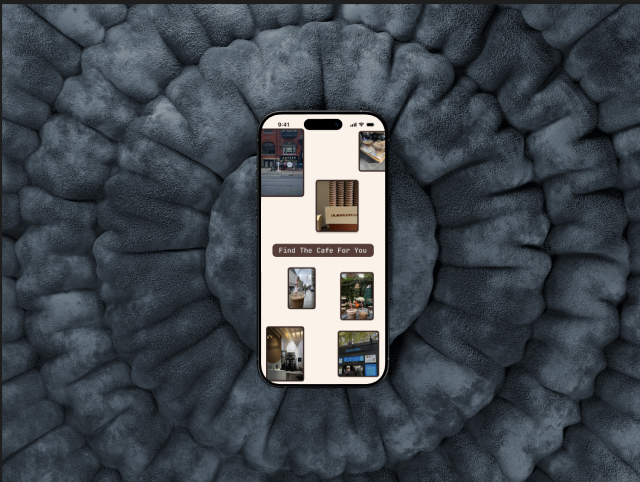
The Ultimate Work Space and Coffee Guide
This app was designed to address the challenges Gen Z users face when searching for cafés that align with their preferences—whether for remote work or casual visits. Many users expressed a lack of trust in online reviews, often perceiving popular spots as overrated and overcrowded
Year
2025
Duration
10 weeks

Introduction
Remote workers and coffee lovers often struggle to find cafes that offer both a great work environment and quality coffee. Existing review platforms lack transparency and key details like Wi-Fi speed, noise levels, and seating comfort.
Find My Cafe makes it easy to discover work-friendly cafes with real insights from a trusted community. Filter by amenities, check real-time occupancy and find the perfect spot for your next work session.
Work smarter. Sip better. Find your cafe.
Role: UX Designer
Tools Used: Figma, Figjam, Figma Plugins
iOS
Methodology
The Double Diamond Approach

The Problem
Many remote workers and coffee enthusiasts struggle to find reliable cafes that offer both a productive working environment and high-quality coffee. According to a survey by the National Coffee Association, 67% of Americans drink coffee daily, and a growing number seek spaces that cater to both their caffeine needs and work requirements. However, existing review platforms often lack transparency and fail to emphasize trust.
Research Methodology
Participant Criteria

Interviews

Secondary Research
Coffee Enthusiasts between 17-26
Remote Workers
Students
Research Objectives
Research Objectives
Identify key factors that make a cafe suitable for both productivity and high-quality coffee
Assess the limitations of existing review platforms in providing reliable and transparent cafe recommendations
Explore the preferences and behaviours of remote workers and coffee enthusiasts when selecting a cafe
Evaluate the impact of workspace amenities
Develop a framework for a more transparent and trust worthy review system tailored to work friendly cafes

SecondaryResearch
“Gen Z Mindset is changing coffee”
Fascinating time in the coffee industry, you are responsive to the demands of the market and how to serve a new generation of consumers and interests
The fourth wave of coffee consumption: coffee drinking experience
The power of online reviews to attract more guests
46% - Google reviews is the first place they check restaurant reviews
23% - Check Yelp
Why?
Trust and credibility
Guest risk mitigation
Shaping Expectations
Influencing decision making
Amplifying word of mouth
The domino effect
The trend brewing
The incorporation of casual, coffee shop like atmospheres into modern work spaces
Assumptions
Remote workers and coffee enthusiasts seek cafes that offer both a productive work environment and high-quality coffee.
Existing review platforms lack transparency and fail to highlight key work-friendly factors like Wi-Fi reliability, seating comfort, and noise levels.
Trustworthy and transparent reviews are essential for users when choosing a work-friendly cafe.
The demand for work-friendly cafes is growing as remote work continues to rise.
Social media often overhypes cafes, making users skeptical of paid or biased reviews.
Click on the image below to view more

Through these assumptions, I created a well thought out interview script to see if they are correct or not
Getting to know the users
-
What factors are most important to you when choosing a cafe to work from?
How do you currently find new cafes to work in? (e.g., word of mouth, Google reviews, social media)
Have you ever been disappointed by a cafe that seemed work-friendly but wasn’t? If so, why? -
What are the biggest challenges you face when working from cafes?
How important are factors like Wi-Fi speed, noise levels, seating comfort, and power outlets in your decision-making?
Do you trust existing review platforms when searching for work-friendly cafes? Why or why not? -
How important is coffee quality when choosing a café for work?
Do you ever compromise on coffee quality for a better work environment, or vice versa? -
What would make it easier for you to find the perfect cafe for both work and coffee?
If a platform existed that provided transparent and reliable reviews on work-friendly cafes, would you use it? What features would you want it to have?

Hypothesis
Remote workers and coffee lovers need a reliable way to find cafes that support both productivity and great coffee. If they have access to a transparent review platform that highlights key factors like Wi-Fi quality, seating comfort, noise levels, and coffee experience, they will be more confident in choosing cafes that meet their needs. This will help them work more efficiently while enjoying their favorite coffee in a well-suited environment.

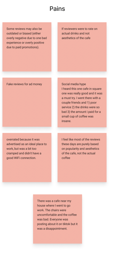
“Many reviews focus on food and service rather than work friendliness, and experiences vary widely. Some reviews may also be outdated or biased (overly negative or overly positive)”
Interview Highlights
These interviews were done virtually - I did virtual interviews so I can exactly see how the interviewee was reacting to each question and see their expressions to understand behaviors and pain points.
“fake reviews for ad money”
“I feel like most of the reviews these days are purely based on popularity and the aesthetics of the cafe as opposed to the real coffee”

Users Pain Points
Users Motivations
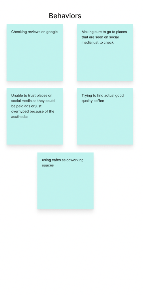
Users Behaviors
Lack of Authenticity
Focus on Work Environment
Lack of Focus on Quality
What we learnt
People strongly feel that they want to be able to have a friendly staff at cafes so that they feel comfortable there
People are using cafes as a coworking space and feel as though they are able to be more productive in cafes but would like to know how busy it really is and what the services are like
Users believe that most of the reviews on social media are not authentic and the real review of the actual coffee are missing
Through this, we understand the focus on lack of authenticity, understand how busy it is and know what the staff is like
Social media chases the next trend as opposed to understanding the cafe itself, these can be paid marketing posts
Google reviews are not focused on amenities available or the peak hours
Through this, the aim became more focused on using cafes as a workspace to focus on things that will make people feel more comfortable working there and being productive
Through these interviews,I streamlined the task and catered it more towards finding that working cafe for users and making the finding and selection process easier for the users. This was the recurring pain point for users.
Interview Insights
After user interviews, I was able to understand the demographic better and streamlined my findings into 3 major themes
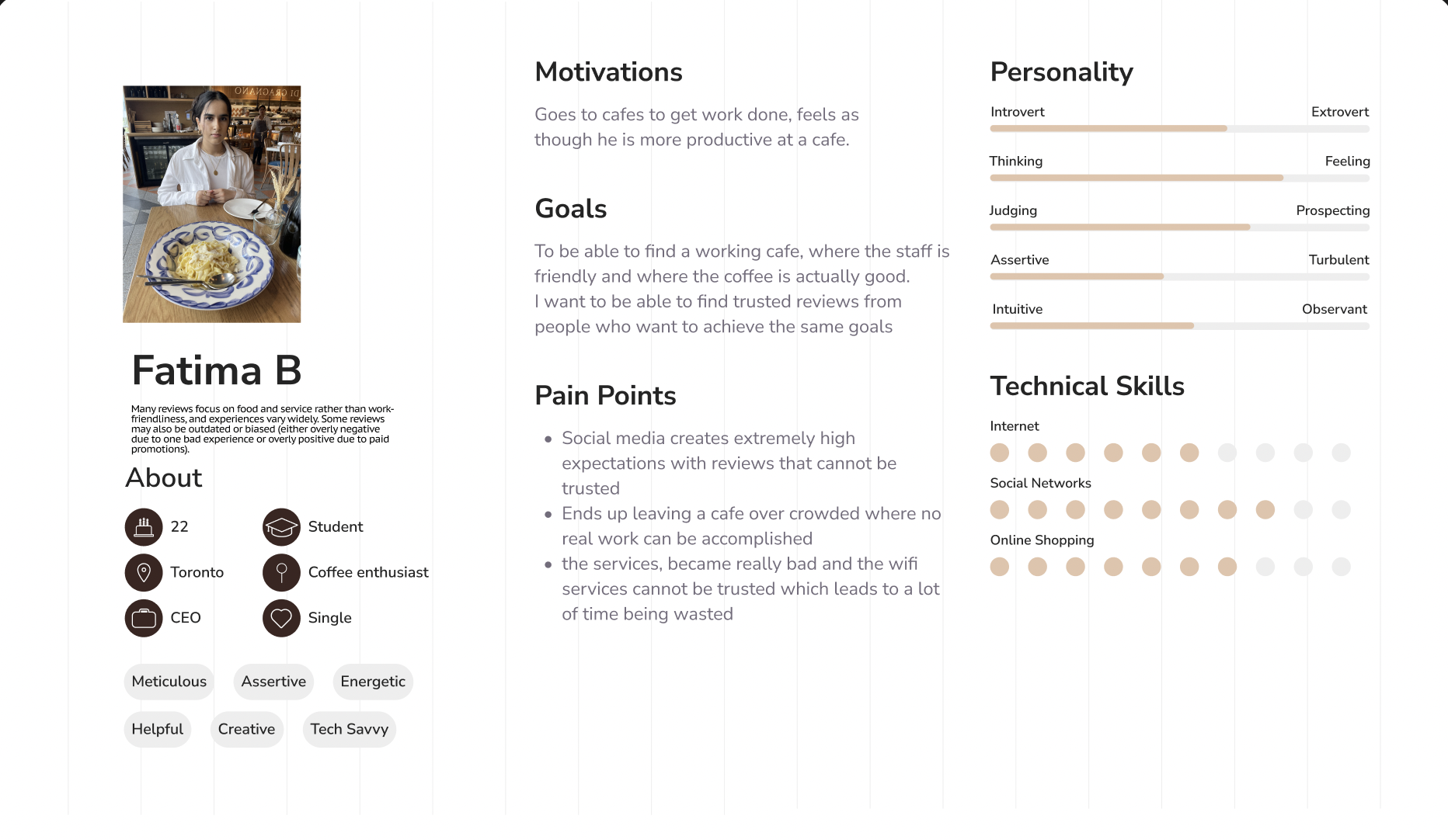
Persona
How Might We
How Might We
How might we improve the transparency of cafe reviews for coffee enthusiasts so that they can confidently choose spaces that meet their needs for both work and coffee quality with special focus on rating working factors also? (click to expand to experience map)
User Stories

Epics
Work-friendly cafe features
Coffee quality and experience
Reviews and credibility
Why? The most amount of user stories and coincides with the HMW and problem statement. Also aligns with the target user.
Work Friendly Cafe Features: As a user, I want to filter cafes based on work-friendly amenities like outlets and comfortable seating so that I can choose a space that meets my needs
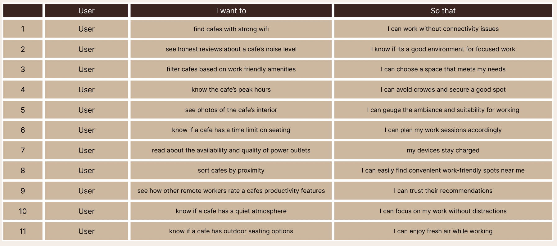
WHY? It meets a practical need by balancing usability and comfort, making it essential for a productive, work-friendly environment.
Task Flow

At this point I started the designing, from the inspiration then the ideation; sketching to the final prototype
UI Inspiration

Exploratory Sketches
Solution Sketches

After exploring different ways to design the app, I streamlined it further to come up with the final sketch these will now translate to wireframes
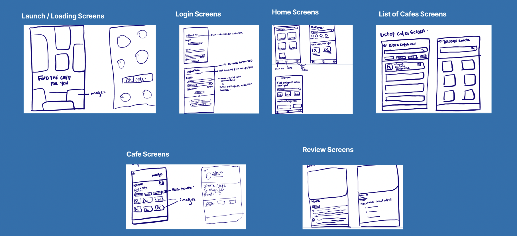
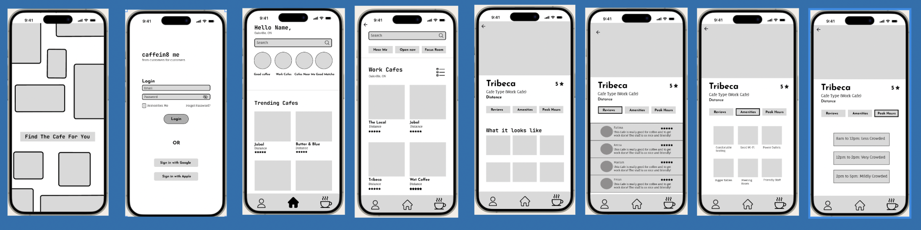
Low Fidelity Wireframes

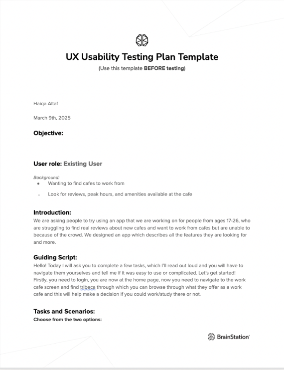
Usability Testing Plan
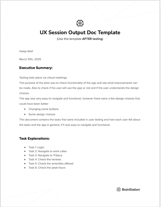
Usability Test 1

Results of getting the tasks done in the first round of testing

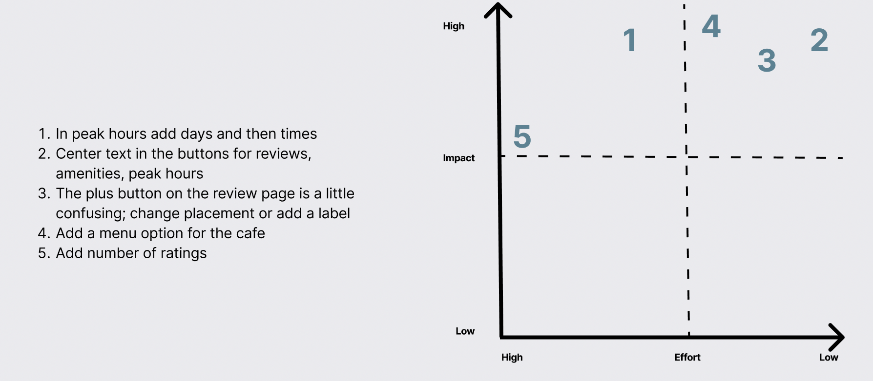
Design Prioritization Matrix
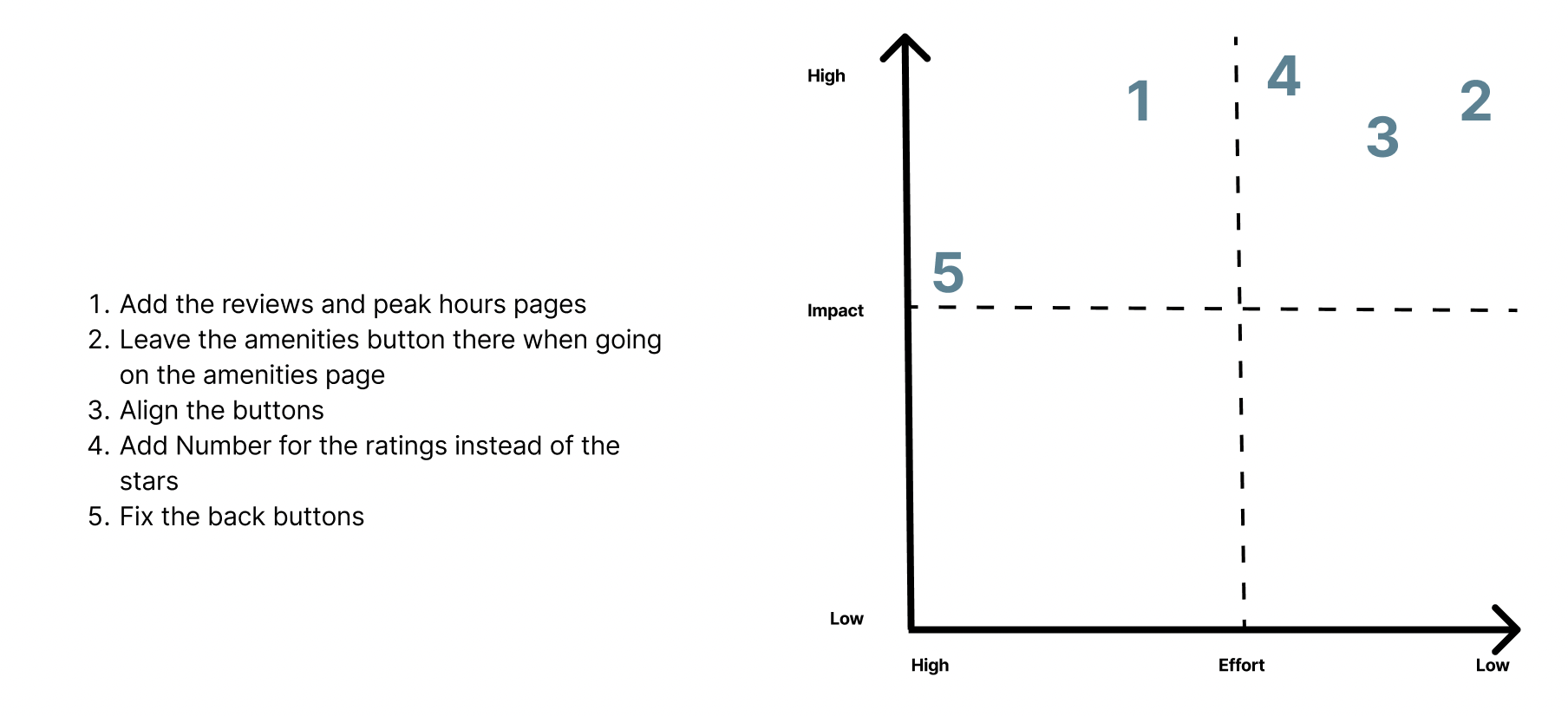
Iterations
After the design prioritization matrix, I made changes and revisions on the wireframes based on that


And added 2 new screens

Final Wireframes
Usability Test 2
Design Prioritization
Branding
Branding
Now let's make this come to life
How did I achieve this and make sure that the brand was making the users feel exactly how I envisioned it to be. Being warm and inviting, not overwhelming and still motivating people to be productive.
Let’s start with some words to describe the vibe I was going for
Productive, Energized, Motivated, Caffeinated, Getting things done, Human interaction, Happy, Organized, Scheduled, Satisfied
Through these words I created a mood board
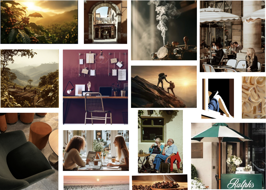
This mood board without literally displaying anything related to the actual product sets a tone and feeling that the final product should give. A successful mood board is able to give the users that feeling which motivates them to use the app and also wants them to do exactly what the app is asking for.
After peer critique for the initial mood board, the target users said they felt warm, invited, and wanted to drink coffee right now. Through this critique, I knew this was the perfect mood board and was giving exactly what it had to
Through the mood board I extracted different colors to set the brand colors, first I used a few solid singular colors

More Productive than chill
More Energized than Calm
More Welcoming than discomfort
More Motivated than lazy
More Achieving than comforting
More Human based than isolating
More Happy than sad
More Warm than Cold
More Scheduled than chaotic
More Satisfied than disappointing
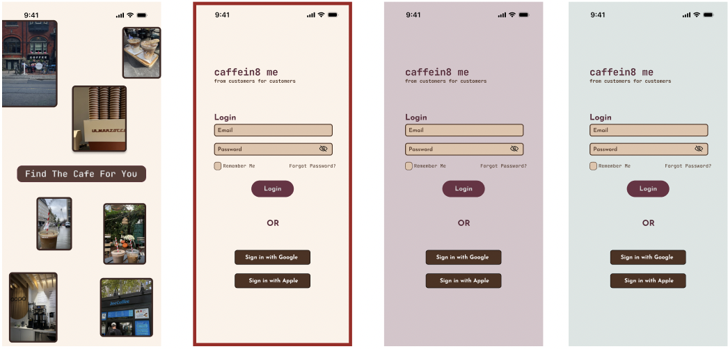
Then, I selected a primary color that will be 60% of the app. After this selection I explored the rest of the colors to see which one will be the best for the 10%. I wanted this to be a darker color to make it pop. For the 30% I played around with the gradient tool on figma and achieved the perfect in between shade for the 30%. This way I successfully used the 60-30-10 rule in design
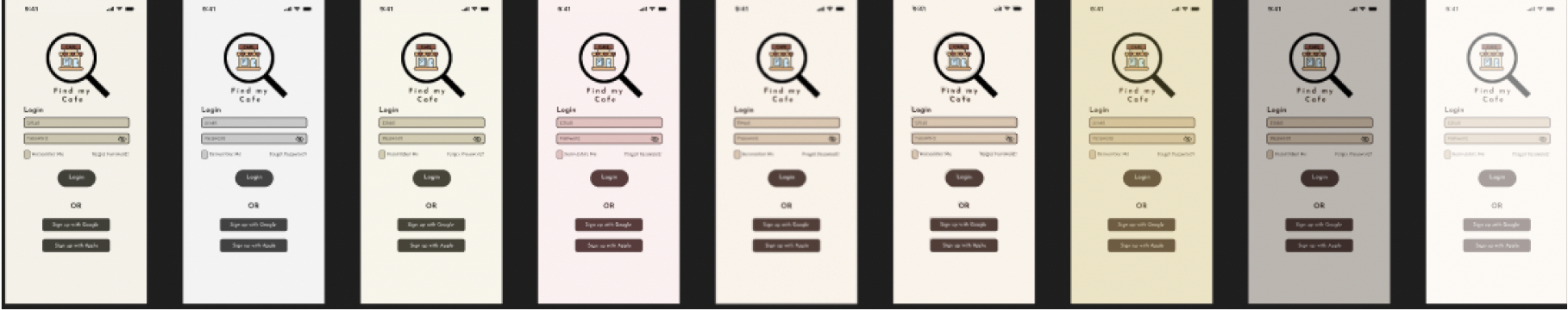
UI Colors and Color Injection
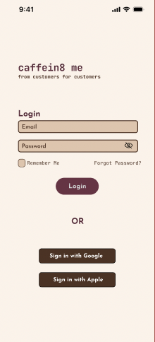
After this step, I came up with different colors being used as accents, or when a button is pressed. This created the UI colors. Now I had to make sure if these colors actually looked good and passed the accessibility concerns for the app. I tested different shades and combinations and finally had a set color scheme
Selected Colour Theme

Why this?
This scheme aligned with the adjectives as well as the mood board. Consistency throughout the process is key.
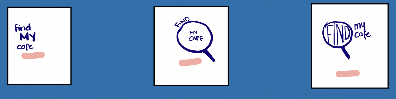
Brand Name

Finally went with the one which was simple, easy to remember but also explained the purpose of the brand. Adding the word MY displayed the importance how each and everyone is looking for a cafe for a different reason and this gave that customization and shows users how the app cared about what they wanted.
Initial Sketches

Word Mark
Selected Sketches
Vector

The magnifying glass resonated with the word find and displayed the purpose of the app really well.
Translating this into a digital design was difficult and was not coming out exactly the way I wanted it to be so after a lot of effort I finally came up with something close to it
The Icon

Vision Simulator
Accessibility
Screens

Buttons

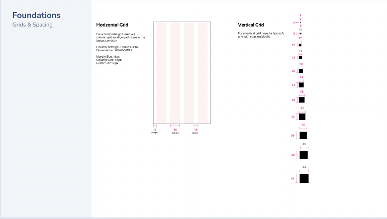
UI Library
UI Library


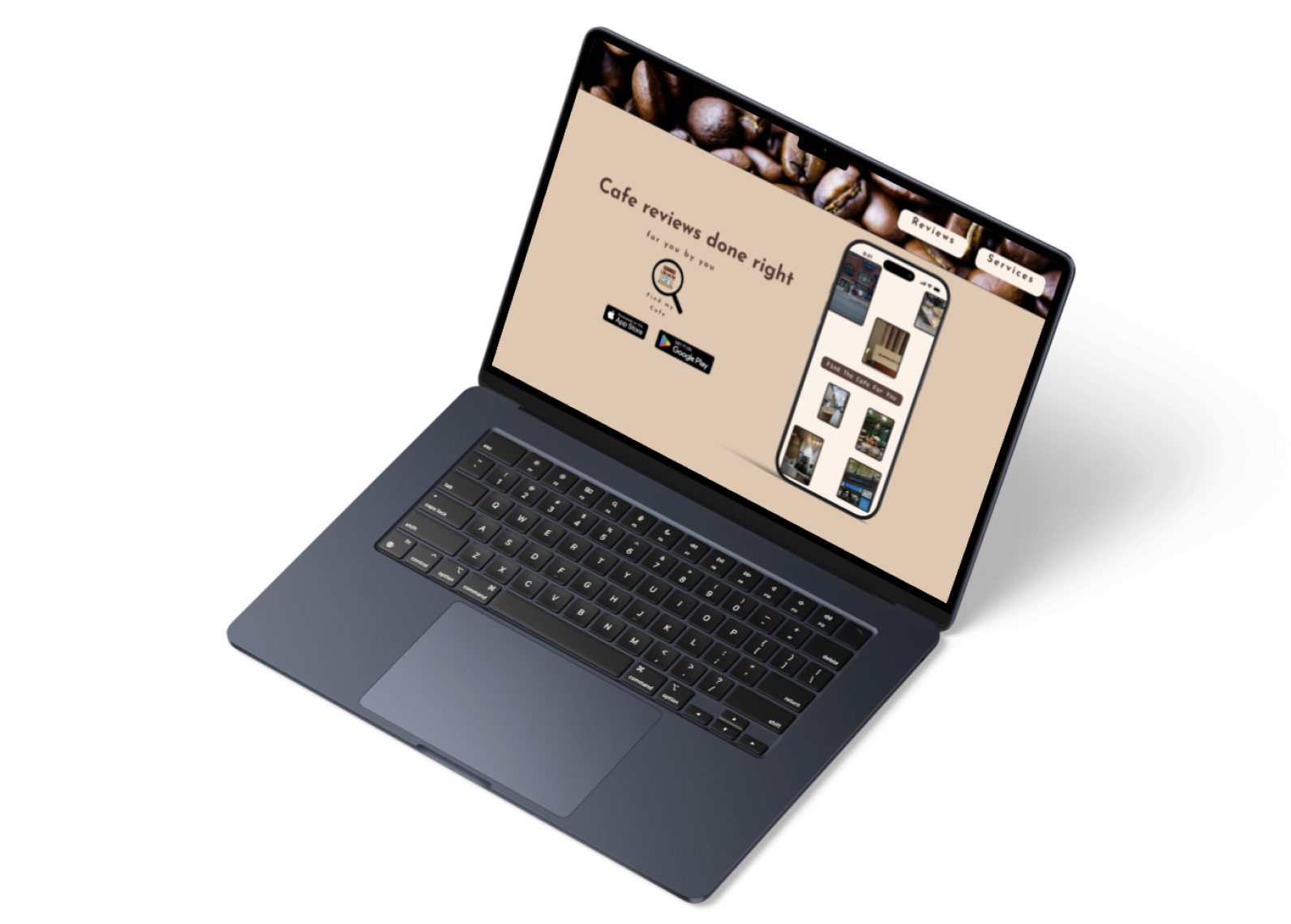
Marketing Website


I created the Find My Cafe marketing website to showcase the app’s value proposition, highlight its user-focused features, and build credibility with a broader audience. The goal was to attract and engage users who are looking for reliable, curated café recommendations—especially those frustrated with overcrowded or overrated spots. It also served as a platform to communicate the brand story and encourage app downloads through compelling visuals and clear messaging.
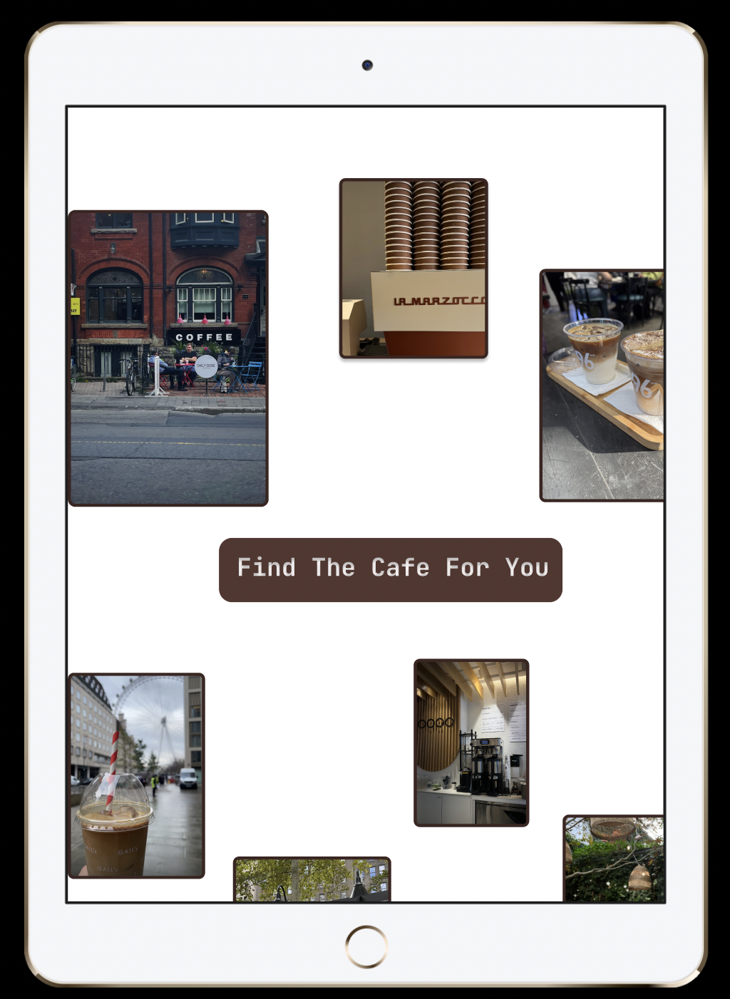
Alternate Platform - iPad
The app is targeted toward gen Z who are studying/ or working. Usually, they work with iPads and most of these people you see at cafes have the entire ecosystem which is why I decided to use an iPad for the alternate platform device

Key Learnings
User interviews uncovered hidden frustrations, like mistrust in reviews and overcrowded cafés.
Simple, intuitive flows made navigation easier and more enjoyable.
Iterative testing helped refine small but impactful design details.
Balancing user needs with business goals ensured a practical and marketable solution.
Design is an ongoing process—feedback was key at every stage.

The Future
Handoff finalized designs and assets to developers.
Collaborate during development to ensure design accuracy.
Test the product for UI/UX consistency and fix issues.
Gather user feedback post-launch.
Iterate and improve based on real-world use

The Impact
Now users can
Discover cafés that truly match their vibe and needs.
Stay productive by planning visits around their ideal workflow.
Access authentic, trustworthy reviews from real users.
Tarot Cards
-
Someone could use the app to crowd or gatekeep certain cafés, making once quiet spots overly busy or inaccessible to locals.
-
Are you tracking user location or preferences? If so, how transparently are you communicating this, and is the data truly necessary for the experience?
-
If Find My Cafe becomes very popular, will it shift the café culture in neighborhoods? Could it create trends that harm smaller, less visible businesses?
-
Are Gen Z preferences overrepresented? Are other groups (e.g. older users, freelancers outside the trend cycle) considered in the experience?
-
Are the reviews and café highlights inclusive of diverse communities, or do they reinforce popular or mainstream spots only?